JARGON
A downloadable game for Windows
"Jargon" by the Mighty Venus Game Studio
[CONTROLS]
WASD - Movement Buttons
E - Interact Button
Q - Opens Quester App
TAB- Opens Inventory
ESC - Pause Button
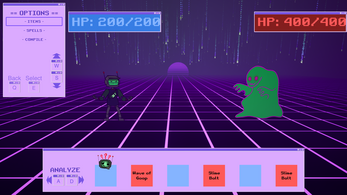
Jargon is a micro-RPG about a Robot that can cast spells.
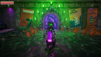
Journey as DEZ, our main hero, as they traverse Hokusai city - a city in post-apocalyptic Japan that is slowly recovering from a life altering Y2K event that takes out almost all technology.
in the world of Jargon, discover how this city is imbued with Magic and how magic has replaced most common technology.
Our hero, DEZ, is our bridge between magic and technology. Within this newfound world and abilities can DEZ navigate around and save the city from the week-to-week Monster that invade Hokusai?
Jargon is a Project developed by the Mighty Venus Game Studio.
We designed this game to be a love letter to old 90s RPG that we all grew up playing.
We hope you enjoying playing the game. "Play and immerse yourself in the world of Jargon"!
Special thanks to Karen Morrison, Ian Constable, IGDA, And the wonderful folks at intrepid studios.
Install Instructions
step 1 - Download the zip file
step 2 - extract the file
step 3 - open the new folders until you see the Jargon.exe application
step 4 - double click Jargon.exe
step 5 - enjoy ^w^
| Status | Prototype |
| Platforms | Windows |
| Authors | MochaMics, Ghostrider231, ConstantJames, Sepehr Arya Yari |
| Genre | Role Playing |
| Made with | Unreal Engine |
| Tags | Atmospheric, Colorful, Funny, Magic, micro-rpg, Robots, Singleplayer, Unreal Engine, Wizards |
| Average session | About an hour |
| Languages | English |
| Inputs | Keyboard |
Comments
Log in with itch.io to leave a comment.
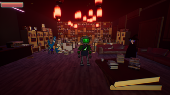
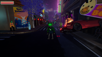
A clever, zany little game that took about an hour to complete. The characters are very fun and silly, and the environment is very thoughtfully designed. I very much enjoyed exploring, looking at all the posters, and talking to all the silly NPC's. The visual style of the characters was really fun and stylized.
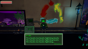
There were a lot of little errors with capitalization and punctuation which were unfortunate because this game depends heavily on dialogue and quest text. There were also several environmental textures which were blurry and pixelated, which sucked when it was posters that I knew must have been clever and I wanted to see. I could see that the developers wanted to do something interesting with the combat system, but it didn't really stand out to me. I felt that combat was secondary in this game, though, so it wasn't a big deal.
The UI had a nice, retro vibe. However, I thought there was no reason for the mouse cursor to be used in the menu when it isn't used at any other time, even in the combat encounters. I also thought that the combat UI should have matched the exploration UI better, instead of using different containers.
Great work. Keep creating!